
1. ElevatedButton
2. OutlinedButton
3. TextButton
기본적으로 세가지 형태의 버튼 스타일을 제공한다.
하지만, 공통적으로 스타일 주는 방식은 아래와 같이 동일하다.
ElevatedButton(
	onPress: (){}, // onPress : null 이면 비활성화된다.
    style: ElevatedButton.styleFrom(
    /// 배경색깔
    backgroundColor : Colors.red,
    /// 비활성화 되었을 때 색상
    disableBackgroundColor : Colors.gray;
    /// 배경 위 색깔
    foregroundColor : Colors.white,
    shadowColor : Colors.green,
    elevation : 10.0,
    textStyle : TextStyle(
    	fontWeight : FontWeight.w700,
        fontSize : 20.0,
    ),
    padding: EdgeInsets.all(20.0),
    side : BorderSide (
    	color: Colors.black,
        width: 12.0,

    ),
    ///size
    minimumSize : Size (500,150),
    maximumSize : Size (100,150),
    fixedSize: Size(100,150),
    child: Text('ElevatedButton')

)
그러면, 버튼의 상태에 따른 스타일은 어떻게 줄까?
ButtonStyle을 사용하면된다.
OutlinedButton(
	onPressed : (){},
    style : ButtonStyle(
    	/**
        	hoverd -
            focused -
            pressed -
            dragged -
            selected -
            scrollUnder,
            disabled -
            error -
        **/

    	// MaterialStateProperty 사용하애함
    	backgroundColor: MaterialStateProperty.all(
        	Colors.red,
        )

    ),
)
이렇게 resolveWith 함수를 사용하면, 상태에 따라 색상을 변경해줄 수 있다.
그러면, 버튼의 모양(Shape)은 어떻게 변경가능할까? -> shape를 사용해서 하면 된다.!!!
/// button 내에서 styleFrom 적용...
OutlinedButton.styleFrom(
shape : rectangleBorder(
borderRadius : BorderRadius.circular(
10.0
)
)
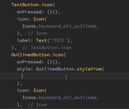
)버튼에 아이콘도 넣을 수 있다.


최근댓글